Seedance 2.0 Color Palette Prompts: 3 to 5 Anchors That Work
How to write Seedance 2.0 color palette prompts. Pick 3 to 5 named color anchors and let the model grade your clip consistently across every frame.
Why your AI clips all look the same
Seedance 2.0 color palette prompts are the fastest way to stop every clip you generate from looking like a slightly different version of the same warm amber default. Generate ten Seedance 2.0 clips with no color guidance and they will all look like cousins. Slightly warm. Slightly soft. Slightly amber. The reason is that the model has a default grade it falls back on when you do not specify colors, and that default is the average of its training data.
This is one of the most underused techniques in AI video prompting. Most people obsess over lighting and camera moves and never think about color anchors. Color is what gives a brand its visual identity. Color is what tells the viewer this is a luxury ad, this is a fitness ad, this is a kitchen scene, this is a moody noir piece. Without color anchors, your clips bleed into the same mid range warm look.
This guide breaks down how to write Seedance 2.0 color palette prompts that hold across multiple generations. We will explain what an anchor is, why three to five is the magic number, and walk through five palette recipes you can copy: warm sunset, cool noir, fresh daylight, brand bold, and earth toned natural. Every recipe ships with a copyable prompt.
The principle: name the anchors, not the grade
Seedance 2.0 color palette prompts work best when you name three to five color anchors as plain English words inside the prompt. Use descriptive phrases like burnt orange, slate gray, deep teal instead of hex codes or paint chip names. Include skin tones in the anchor list and pair the palette with a contrast cue like deep shadows or soft contrast to lock the grade across the entire clip.
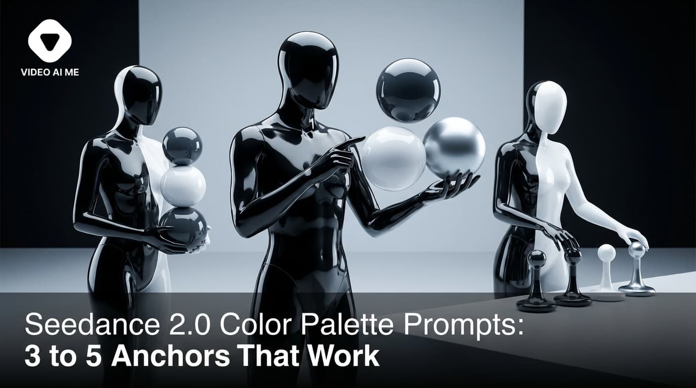
The key word is anchors. An anchor is a single named color that the model uses as a reference point. You are not asking for a literal grade. You are giving the model three to five color targets and letting it interpolate between them. The result is a consistent visual register across the whole clip even though no individual pixel is forced.
Three anchors is the minimum. Two colors look accidental. Three colors look intentional. Five anchors is the maximum. Beyond five, the model starts to confuse colors and the grade gets muddy.
The other thing color anchors do is create predictability across multiple generations. Run the same prompt three times with the same palette and the three clips will all look like they belong to the same campaign. Without the palette, they drift in different directions.
The naming convention matters. Use descriptive words, not paint chip names or hex codes. Burnt orange beats Pantone 1505. Slate gray beats #6B7280. Deep teal beats RGB 0 100 100. The model has been trained on natural language, not on color systems.
A last tip. Pair your palette with a contrast cue. Naming a warm palette without saying anything about contrast often produces a flat warm clip. Adding deep shadows or strong contrast or soft contrast pulls the grade in the right direction.
Recipe 1: Warm sunset palette
For golden hour, sunset, and warm outdoor scenes.
UGC creator, energetic woman in a denim jacket walking through a tree lined park at golden hour, slow tracking shot from the side. She turns to the camera with a smile. Filmed with iPhone, handheld, warm sunset backlight, slight lens flare, palette of burnt orange, soft amber, dusty rose, deep olive green, warm cream skin tones. - No music, no logo, no text on screen.
Why this works: five anchors. Burnt orange for the sunset. Soft amber for the ambient warmth. Dusty rose for the mid tones. Deep olive green for the trees. Warm cream skin tones for the subject. Notice the skin tones are part of the palette, not separate. Seedance 2.0 grades the face the same way it grades the background, so naming the skin tone explicitly keeps the face from going too red or too washed out.
This is the palette to use for any UGC shot at golden hour. Paste this into VIDEO AI ME with your own product swapped in and watch the grade hold across three back to back generations.
Recipe 2: Cool noir palette
For neon noir, night street scenes, and moody luxury content.
Wide shot of a woman in a black trench coat standing on a wet city street at night, slow dolly in, locked tripod base. Hot pink neon sign on a building behind her, cyan LED tube above a storefront on the right, puddles on the asphalt. Filmed in 720p, neon noir lighting, palette of magenta, cyan, deep midnight blue, wet black asphalt, pale skin tones with cool highlights. - No music, no logo, no text on screen.
Why this works: five anchors. Magenta and cyan are the loud signature colors. Deep midnight blue grounds the scene. Wet black asphalt is the texture color (named as a color even though it is technically a surface). Pale skin tones with cool highlights tells Seedance 2.0 to keep the face from drifting warm against the cool background.
The pairing of pink and cyan with deep blue is the canonical neon noir grade. Add the wet asphalt and the skin tone instruction and you get a movie poster look from a single prompt.
Recipe 3: Fresh daylight palette
For clean indoor scenes, kitchen content, lifestyle vlogs, and morning energy clips.
UGC creator, woman in a white linen shirt standing in a bright minimalist kitchen with marble counters and a tall window, holding a glass of fresh orange juice, soft daylight from the left. She lifts the glass toward the camera and smiles. Filmed with iPhone, handheld, palette of bright white, soft cream, sun bleached oak, fresh lemon yellow, cool green leaf accents. - No music, no logo, no text on screen.
Why this works: five anchors. Bright white for the walls and counters. Soft cream for the wardrobe. Sun bleached oak for the cabinetry. Fresh lemon yellow for the orange juice and the highlights. Cool green leaf accents for the plants in the background. The result is a clean morning kitchen grade that feels healthy and aspirational without going clinical.
This is one of our most reused palettes for lifestyle and wellness brands.
Recipe 4: Brand bold palette
For brand specific content where you need the brand colors to dominate the frame.
Product hero shot, sleek matte black audio speaker on a polished concrete pedestal in a minimalist studio. Slow dolly in, low angle, shallow focus on the speaker grille. Soft cool key light from the left, hard rim light from behind. Filmed in 720p, palette of electric blue brand accent, deep matte black, polished concrete gray, white spotlight highlights. - No music, no logo, no text on screen.
Why this works: four anchors. Electric blue brand accent is the dominant brand color. Deep matte black is the product color. Polished concrete gray is the set color. White spotlight highlights are the rim. The phrase brand accent next to the color tells Seedance 2.0 that this color should pop above the others without dominating the entire frame.
Use this structure for any branded product shot. Replace electric blue with whatever your brand color is and Seedance 2.0 will keep that color punchy across every generation. Open VIDEO AI ME and run the prompt with your own brand color word swapped in.
Recipe 5: Earth toned natural palette
For outdoor lifestyle, hiking, fitness, and any content that wants to feel grounded and natural.
UGC creator, man in his thirties in a charcoal hoodie walking along a forest trail in early morning, slow tracking shot from the side. He pauses to look up at the canopy. Filmed with iPhone, handheld, palette of mossy green, warm bark brown, soft sage, slate gray, muted golden sunlight through the leaves. - No music, no logo, no text on screen.
Why this works: five anchors. Mossy green for the foliage. Warm bark brown for the trees. Soft sage for the mid tones. Slate gray for the rocks and the wardrobe. Muted golden sunlight is the lighting accent. Every color is grounded in the natural environment, which keeps the clip from looking like a stock library outdoor video.
This palette is the workhorse for outdoor adventure, fitness coaching, and any wellness brand that wants to feel earthy.
For more grading techniques and the full series, browse the VIDEO AI ME blog and the features page.
Common color palette mistakes
- Using fewer than three anchors. A palette needs at least three colors to feel intentional.
- Using more than five anchors. Beyond five, the model gets confused and the grade goes muddy.
- Using paint chip names or hex codes. Stick to descriptive words like burnt orange or deep teal.
- Forgetting the skin tones. The face needs to be part of the palette or it will drift warm or pink.
- Skipping the contrast cue. Add deep shadows, soft contrast, or strong contrast to shape the grade.
- Mixing palettes that fight each other. A warm sunset palette and a cool noir palette in the same prompt produce a mess. Pick one direction.
- Forgetting to name negative fill. If the shadow side of the face goes too bright, add "negative fill on the camera right side" to deepen the falloff.
How to apply this on VIDEO AI ME
Color palette prompts work in every Seedance 2.0 generation on VIDEO AI ME. Paste any prompt with a named palette and the model will respect it. For brand campaigns where you need the same palette across an entire ad set, save the palette block as a snippet and append it to every new prompt. The 300+ AI actor library, voice cloning, and 70+ language support all stack on top of palette prompts and the colors carry through. For pixel level color control, switch to image to video and upload a reference image with the palette already in it.
Wrapping up
Color palette prompts are the fastest way to make your Seedance 2.0 clips feel like they belong to your brand. Three to five named anchors, descriptive words, skin tones included, contrast cue at the end. Five recipes, copy paste, ship. Try Seedance 2.0 free on VIDEO AI ME and grade your first clip today.
More Seedance 2.0 prompts to study
The four reference videos used throughout this guide (a multi shot street interview, a skatepark product UGC, an unboxing narrative with a timelapse, and a high energy gamer reaction) live as a full copyable library on Seedance 2.0 Prompt Templates: Copy Paste and Ship. Bookmark it and remix any of the four when you need a starting point.
Related Seedance 2.0 guides on VIDEO AI ME
If you want to go deeper, these guides pair well with this one:
- Seedance 2.0 Lighting Prompts: Golden Hour to Neon Noir
- Seedance 2.0: Complete Guide for AI Video Creators
- Seedance 2.0 vs Seedance 1: What Actually Changed
- Seedance 2.0 Features: Everything the New ByteDance Model Can Do
You can also browse the full VIDEO AI ME blog for more AI video tutorials, or jump straight into the product and try Seedance 2.0 free on VIDEO AI ME with no credit card.
Frequently Asked Questions
Share
AI Summary

Paul Grisel
Paul Grisel is the founder of VIDEOAI.ME, dedicated to empowering creators and entrepreneurs with innovative AI-powered video solutions.
@grsl_frReady to Create Professional AI Videos?
Join thousands of entrepreneurs and creators who use VIDEO AI ME to produce stunning videos in minutes, not hours.
- Create professional videos in under 5 minutes
- No video skills experience required, No camera needed
- Hyper-realistic actors that look and sound like real people
Get your first video in minutes
Related Articles

Make AI Video Look Real: AI Ads That Don't Look AI (2026)
Want to make AI video look real? This 2026 how-to walks through the exact realism techniques, prompt cues, and editing passes that kill the AI tells in your video ads.

How to Make an Investor Pitch Video With AI (2026)
Learn how to make an investor pitch video with AI in 2026. A step-by-step VC-facing workflow to script, generate, and send a 90-second pitch that lands meetings.

How to Make a Cold DM Video With AI (2026 Guide)
Learn how to make a cold dm video with AI in 2026. A step-by-step workflow to produce personalized outreach videos at scale that get more replies.